
(or, what’s wrong with the general purpose map on my phone that just seems designed just to show me adverts?)
I decided to write this after reading some of the comments on the wiki here and in the community forum here.
People tend to view “things that appear on a map” as “somewhere that they can go”. For example here:
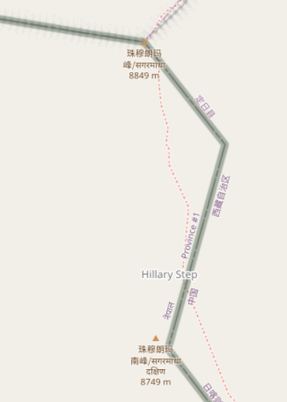
someone who didn’t do their research properly might think that they can just wander along that path to the top of Everest from the south, despite the underlying data suggesting “difficult alpine hiking”. This diary entry is an attempt to try and avoid such misunderstandings.
What options does a map have to different things?
The map at map.atownsend.org.uk shows linear paths and tracks as a single line, It shows legal rights of way (some special categories in England and Wales) and also tries to give some indication of what a walker might expect on that path.
First, before we talk about “showing what a walker might expect”, a note on what options maps have to show linear things differently:
- colour
- width of line
- pattern along the line
- other things drawn alongside the line
How are those shown?
The colour of the line is used for the legal designation - brown for “motor-vehicley” ones, blue for “horsey or cycley” and red for “foot only” and grey for no legal designation, like this:
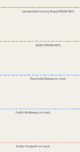
In addition, an overlay colour is used for access rights:
The width of the line is only used to control the “visual weight” of features on the final map - it’s tuned by colour at each zoom level, so that a particular sort of feature does not dominate the map at that zoom level.
The spacing of the pattern along the line shows the width of the path (widely spaced for wider than 2m, narrow spaced for less than):
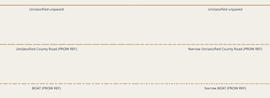
Also, slightly different patterns are used for some slightly different legal designations (for example, bridleways and restricted byways).
“Other things drawn alongside the line” are used for tunnels, long fords, bridges and embankments, for example:

What other OSM tags do we want to show?
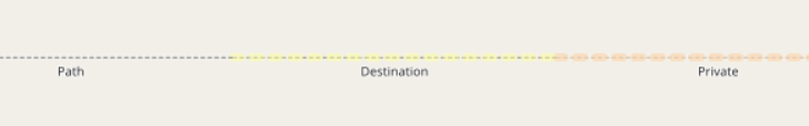
“informal” is sometimes used to show that a path has been created by users rather than by sanctioned by land managers. This only makes sense in places where there are formal paths (which isn’t everywhere), and an informal path isn’t necessarily in any way illegal to use.
“trail_visibility” is used to indicate how easy it is to see a path on the ground.
“sac_scale” is used to show how difficult a path is to use.
The first two are essentially about showing that a particular path might be difficult to see, or that a walker might not want to follow it because it’s not an “official path”; the third is about how to show (and in some cases not to show at all) paths that might actually be dangerous to an unsuspecting walker.
A final tag that isn’t shown is smoothness. Unlike other modes of transport, a low sac_scale path won’t become impassable to most pedestrians because it’s not very smooth.
What is actually the goal of this map style?
It’s designed to show all legal rights of way there is an actual path (theoretical routes exist where there isn’t really a path - the walk across Morecambe Bay is one example).
Paths that are difficult (high SAC scale), informal or not very visible are de-emphasised in the rendering.
Very difficult paths and very poor visibiliry paths that are not public rights of way are suppressed from the default rendering; an overlay is available for these.
What does this mean in practice?
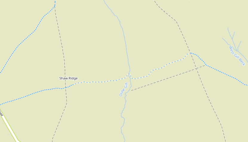
Here’s a section of bridleway in the North Yorkshire Moors with a “trail_visibility=bad” section in the middle:
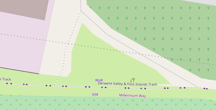
An informal human-created shortcut off the Foss Islands Track in York
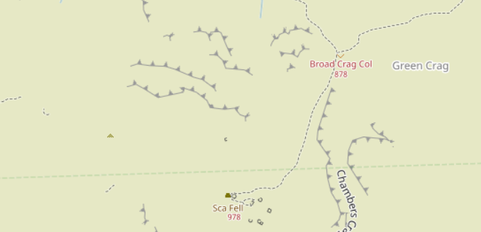
West of Sca Fell, with “difficult” paths excluded by default:
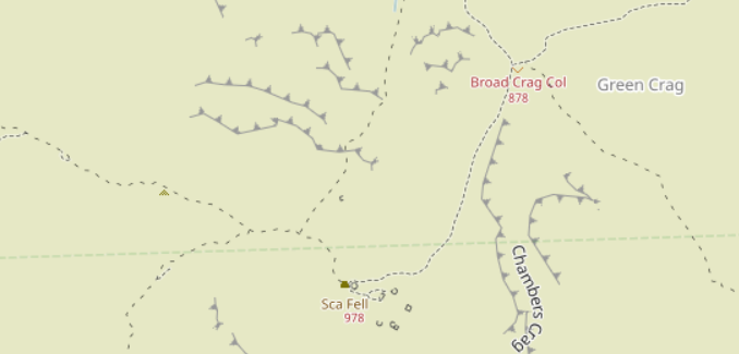
The same view, but with the overlay of “difficult” paths turned on:
The net result is that
- walkers who see a path on the map will see a path on the ground
- paths that are less clear on the ground will be de-emphasised on the map